BACK
Pukta Website
Client
Pukta
Date
2017
Technologies
PHP
HTML5/CSS3
jQuery
Javascript
Platform
Web
ABOUT THE PROJECT
Background
Netlojistik provides IT support for their clients with 16 years of experience. As one of the biggest cloud partners of Microsoft the company also offers help desk, outsourcing, crisis management and many other IT services.
Challange
Considering the changing and evolving environment of the IT sector, the expectations from IT companies has also changed and evolved. They asked our team to rebrand Netlojistik in a way that would answer the best to such changes in order to better represent company values. We worked on a new brand and visual identity, company name, company logo, corporate presentation design, printed material, web design and web development.
Solution
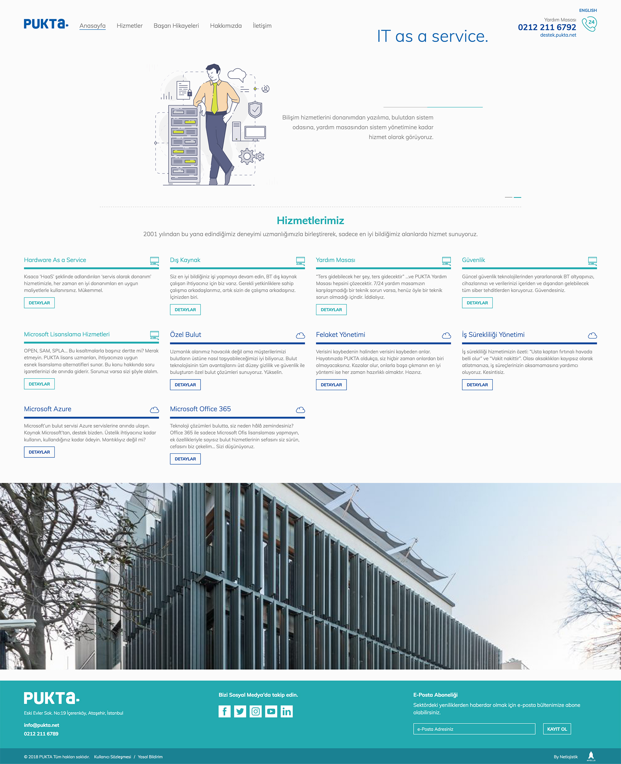
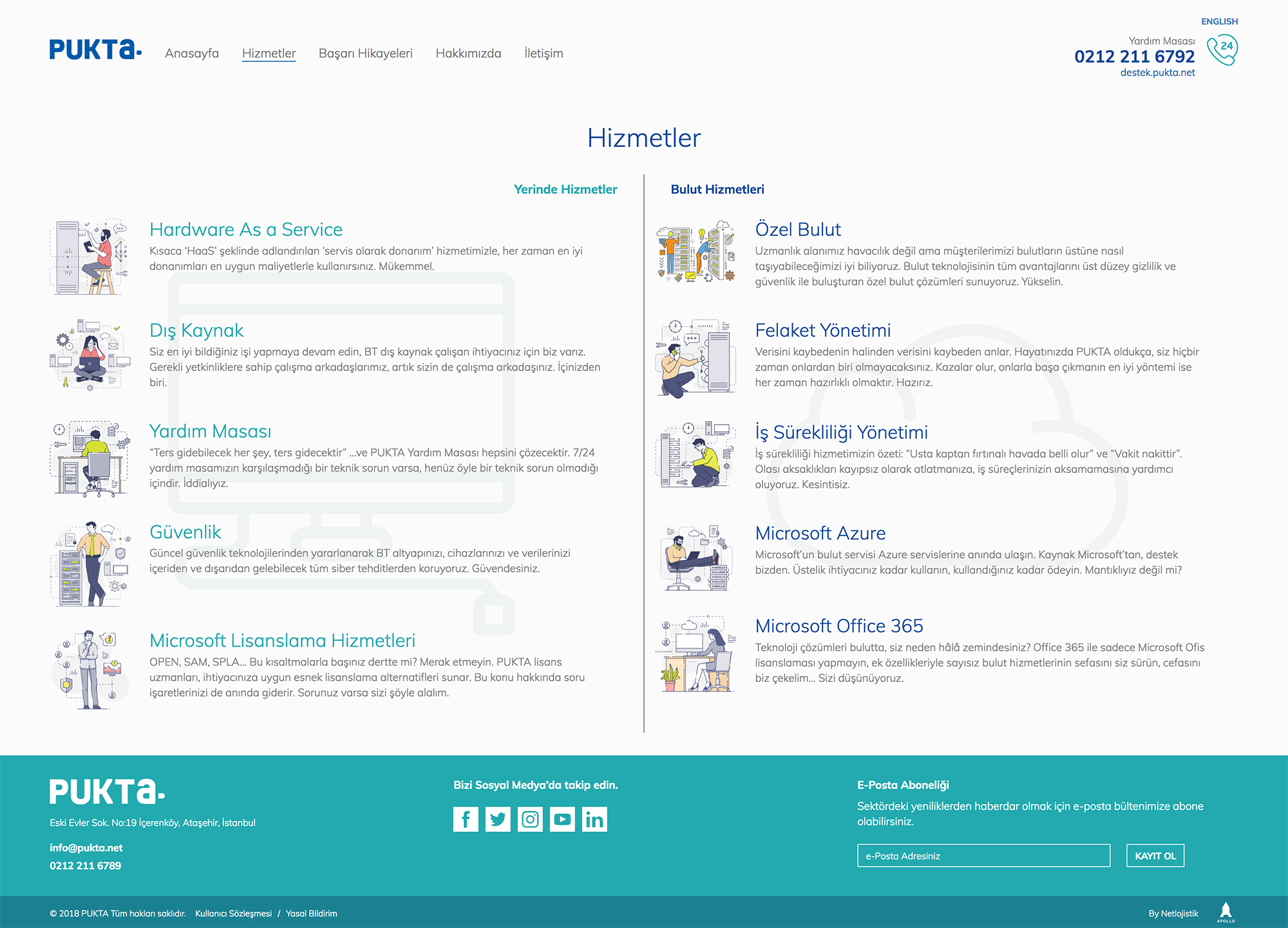
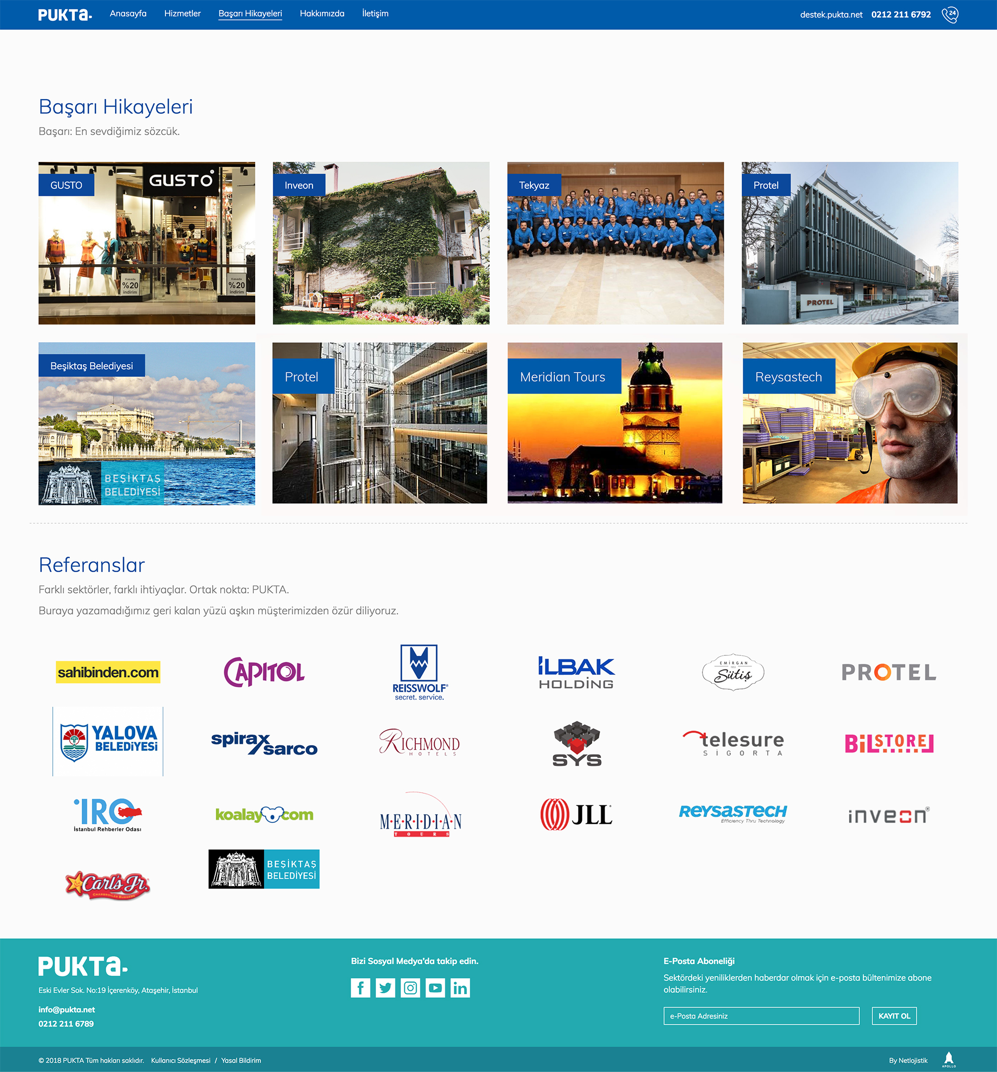
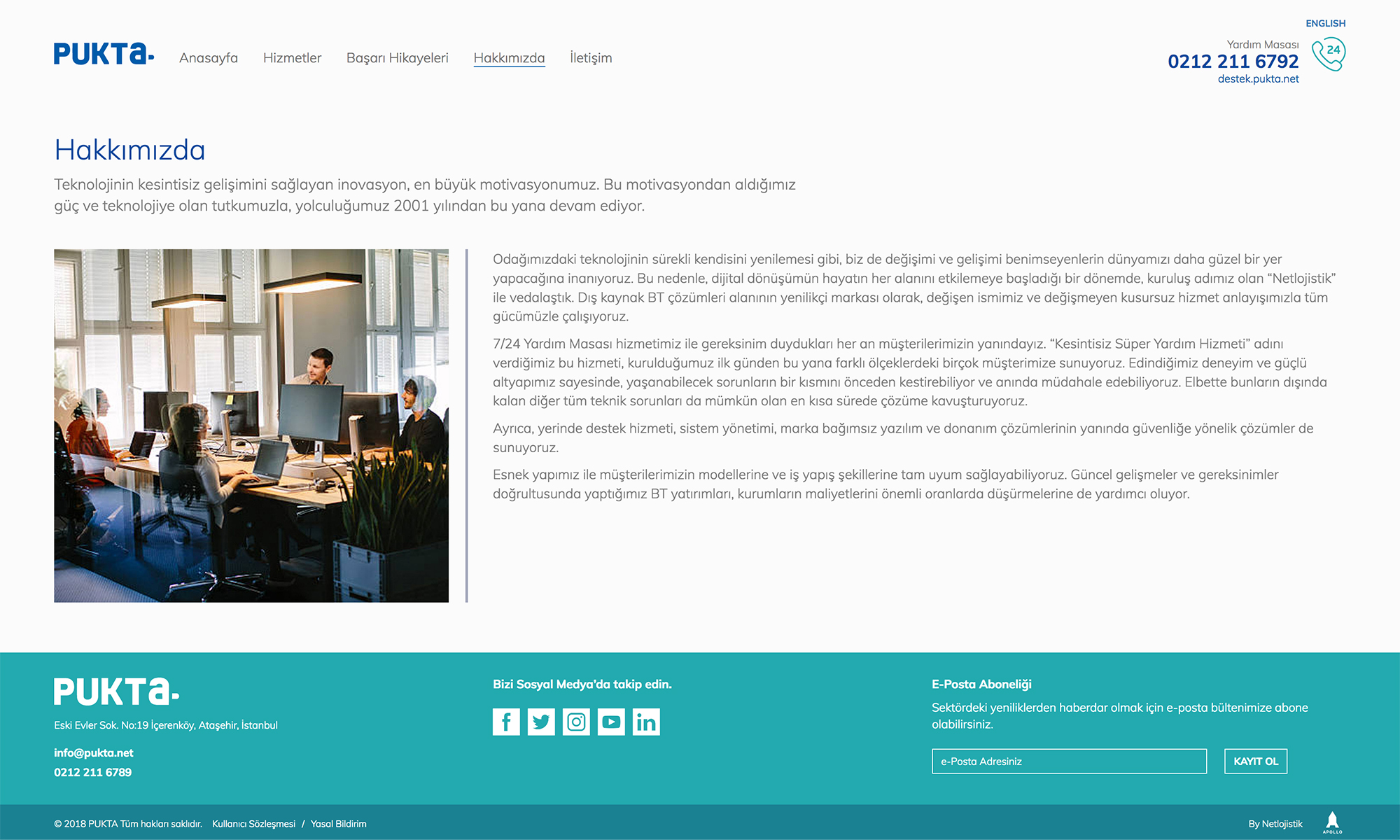
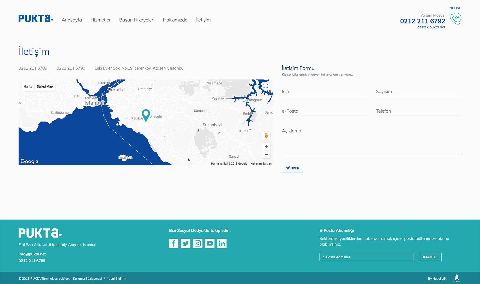
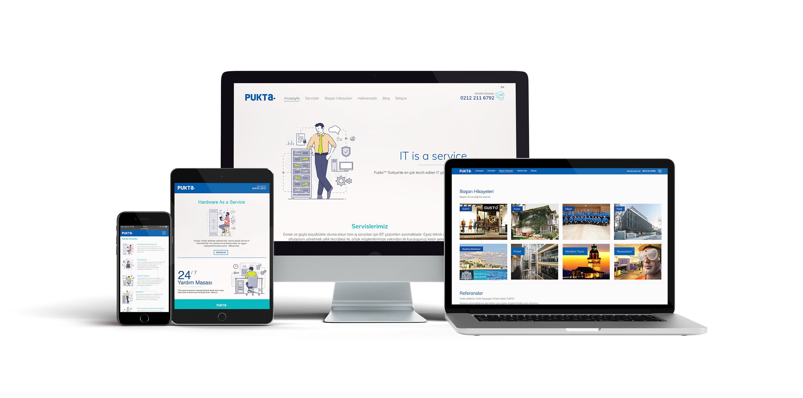
Steps of the model of constant improvement was an inspiration for the name Pukta. The initials in Turkish stand for "plan, implement, check, take measures, act" which also sums up the brand values very well. The dots both inside and next to the letter a emphasise how Pukta works as an outsource service as much as an in-house IT team. The website was designed and developed to be user friendly, accessible, responsive and high performance. For the visual identity, we had a simple and smart approach. The visual language also took its place in the interior architecture of Pukta's office. Now, Pukta is proceeding to write success stories in their industry with a freshened up identity.
